Infographics & Presentations
This start is small, but mighty. Click the image to open a new window with the complete PDF.
Check back soon for new additions.
What keeps me Alive & Healthy
This concept map was created for my 9th graders to help them see how everything they learn in the winter term is connected. Our theme for the term is "What keeps me alive & healthy." While this map doesn't include everything it touches on the main content points in the term.
Graphing & Statistics
You (or your students) have collected data. Now what? This infographic helps you determine what type of graph to use, the appropriate statistical test and the whether you should refer to your data as 'accurate' or 'precise.'
Let’s turn the focus on grades into the focus on Habits
This guide helps students identify their habits and approaches to learning on a continuum in four categories: contributions in class, use of evidence, completion of work and study strategies.
From a 100 page lab manual to one sheet of paper
This concept map was created for the Hutchins Scholars who were extracting DNA from plants. The protocol was so long and took place over so many days, it was easy to lose sight of the end game. Try having students create their own concept maps for procedures.
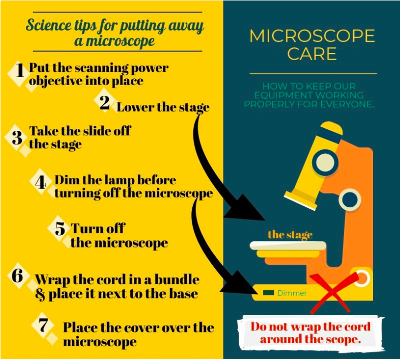
Make taking care of equipment eye catching
Creating visual aids to accompany lab instructions helps students remember how to take care of equipment.
so many choices! Deciding what science course to take doesn’t need to be daunting
This guide helps students, parents and teachers work together to find a science course that offers the right balance of support and challenges.
Effective feedback: strategies to help students internalize your comments
In addition to separating the numerical grade from the comments, this guide offers eight strategies you can implement now to help students build on your feedback.


